Product Design
Harvard Online - Learning Experience Platform
Sole designer for HUIT's multi-tenant learning platform - 400+ courses, 8 Harvard schools, 10,000+ learners across 20 countries.
The Client
Harvard University Information Technology (HUIT), working with the Office of the Vice Provost for Learning, was building a custom learning experience platform (LXP) to host online courses across Harvard’s schools and institutes. Our first tennant was Harvard Online, the university’s continuing education arm, which was using third-party platforms like Coursera and Udemy, but the LXP was designed to support any Harvard school that wanted to offer online learning through a shared platform.
Enterprise Learning Platform
A multi-tenant learning experience platform flexible enough to accommodate wildly different schools and content (think )Harvard Business School Online vs Harvard Law or Kennedy School) while still feeling like one product.
The Problem
Harvard’s 13 schools and institutes all operate independently and have their own platforms, enrollment systems, budgets, and priorities. The Vice Provost’s office saw an opportunity to offer a shared LXP that any school could opt into, giving learners a more cohesive experience while letting each school maintain its own identity and autonomy. But building a multi-tenant platform flexible enough to accommodate wildly different schools while still feeling like one product is a design problem with no simple answer.
The Approach
I joined after MVP development was underway. There were wireframes and aspirational UI concepts, but no real design system, no component library, no multi-state designs, no Figma organization beyond one-off frames. The existing work showed a blue-sky vision but nothing that reflected what the platform would actually look like at launch.
I started by mapping the full system: MVP requirements, technology constraints, and user journeys for authors, administrators, and learners. I revised the existing designs to align with the Vuetify component patterns engineering was already building against, restructured the architecture for responsive and mobile-first layouts, then focused on three priorities:
- A Figma design system mirroring Vuetify, including every text field, button, card, and interactive element with complete state coverage
- Flows and components for every teaching element in the MVP: assessments, text inputs, video, polls, peer review, etc - all each with empty, editing, submitted, scored, and error states
- A comprehensive prototype using real course content from Harvard Law School’s Zero-L program
After launch, I refined the design system for long-term maintainability and have continued as the sole designer for every feature since.
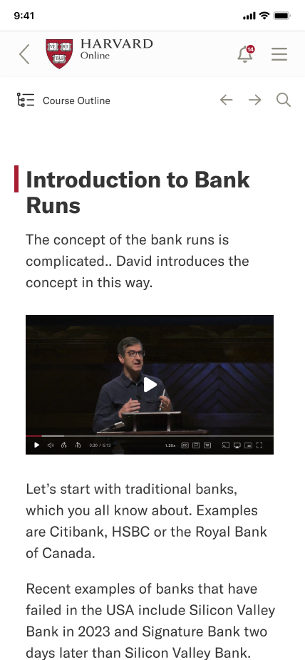
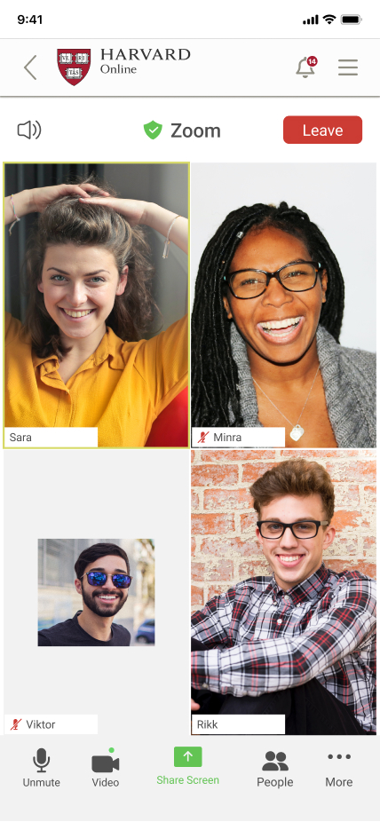
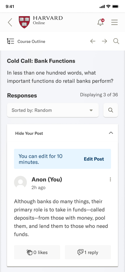
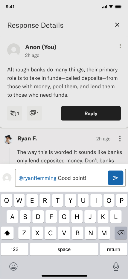
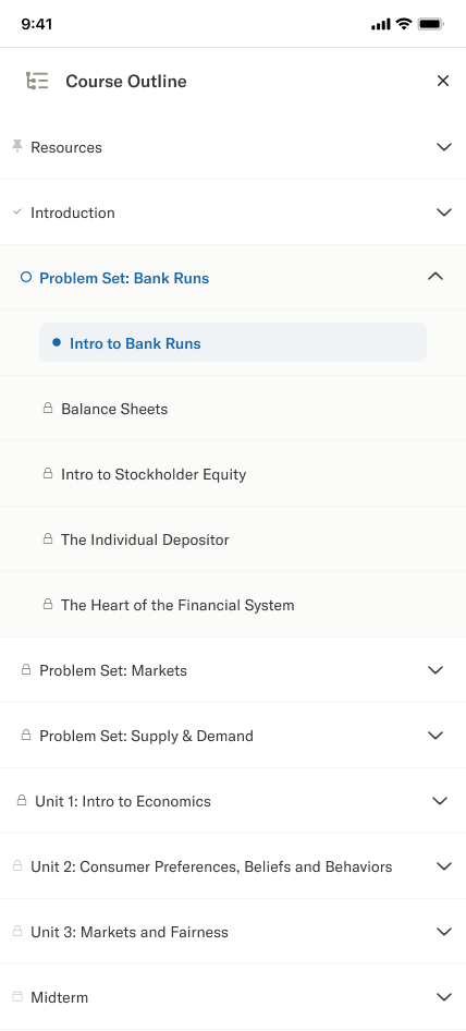
Mobile responsive views: dashboard, events, course content, and navigation
The Solution
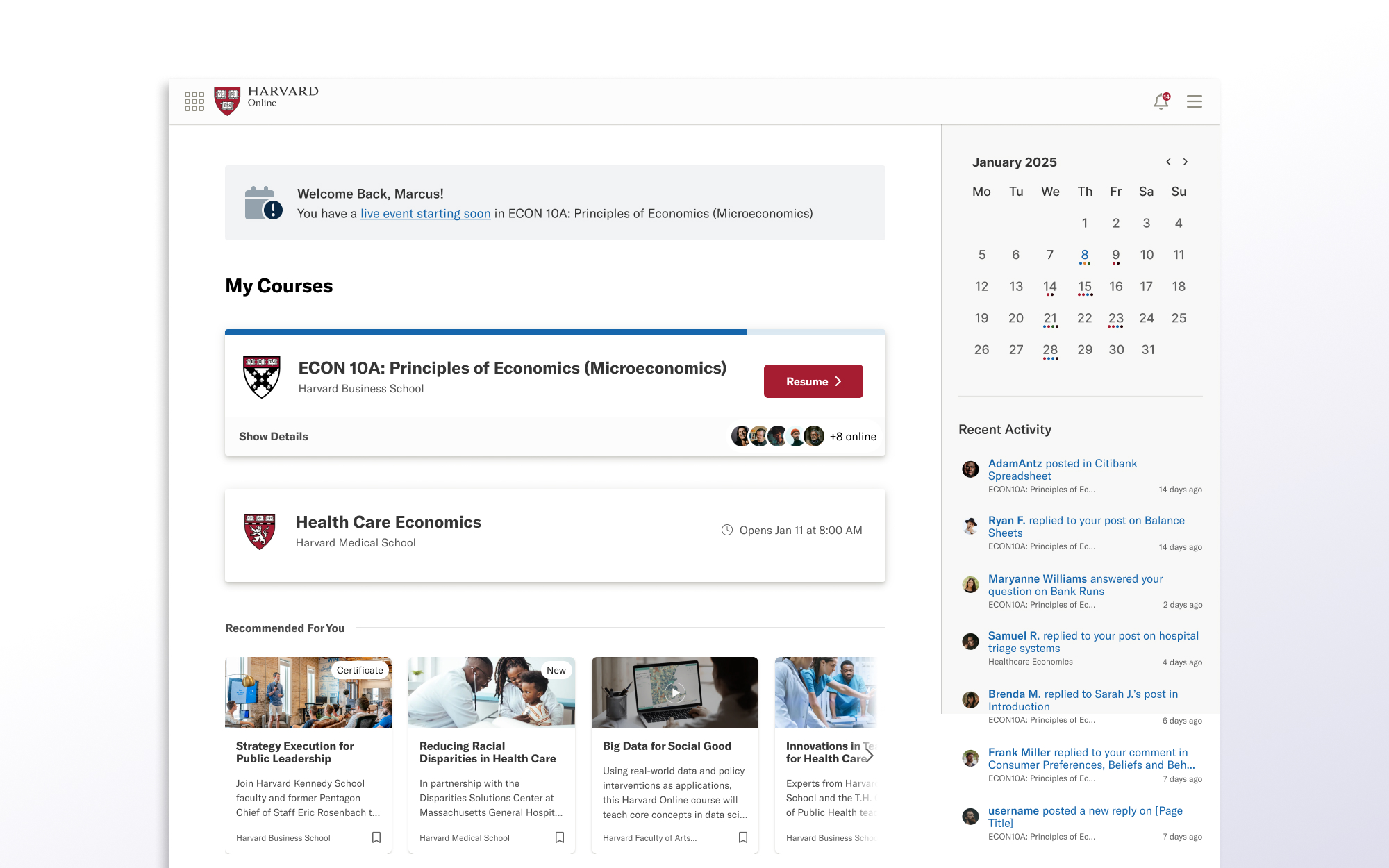
The MVP shipped with a multi-school dashboard, tenant switching, and a learning experience supporting rich text, video, audio, assessments, polls, peer review, and learner profiles. We were intentionally constrained, shipping only what the enginnering team had capacity to build well rather than promising features years away.
Since launch, I’ve designed over 20 additional teaching element types plus calendars, progress tracking, notifications, enrollment management, activity feeds, an AI study assistant, directory, and dark mode. I’ve also maintained the CMS, registration system, and admin interfaces, effectively operating as a full design team of one.
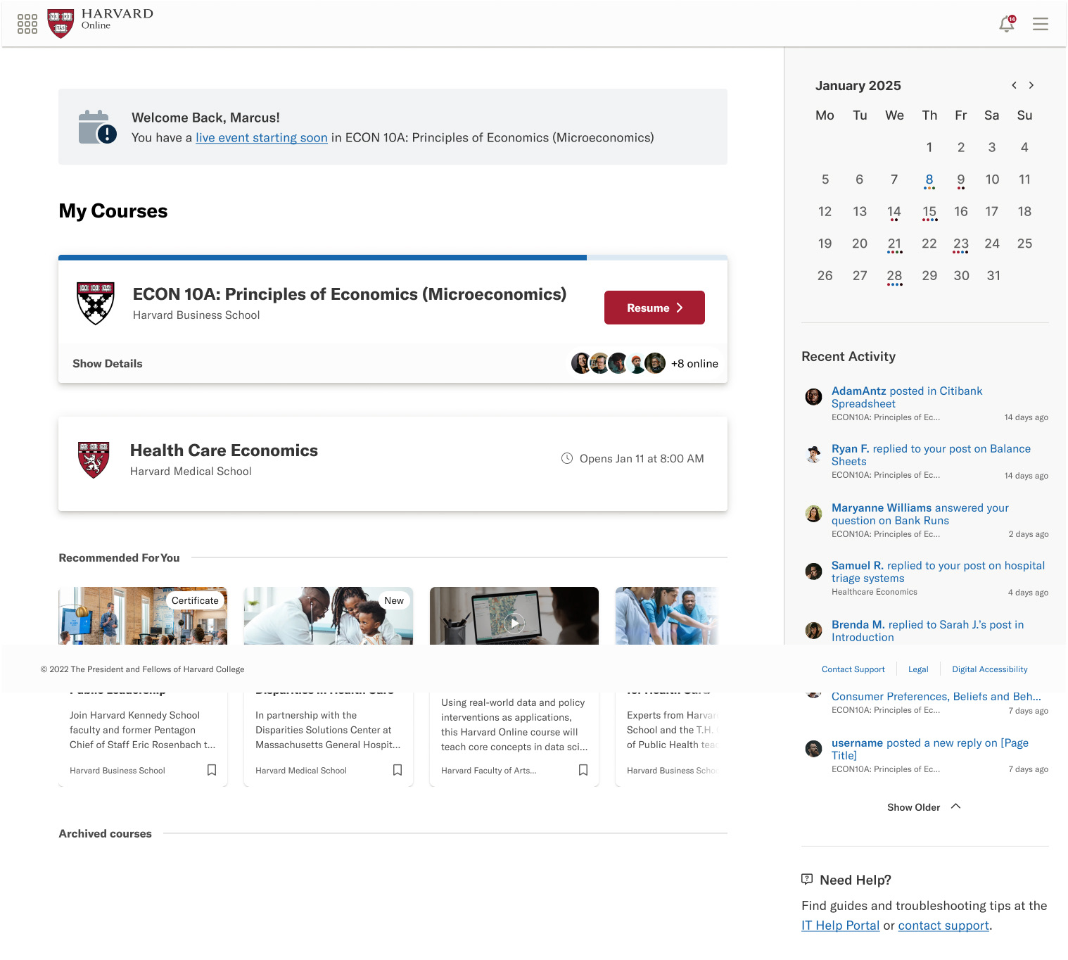
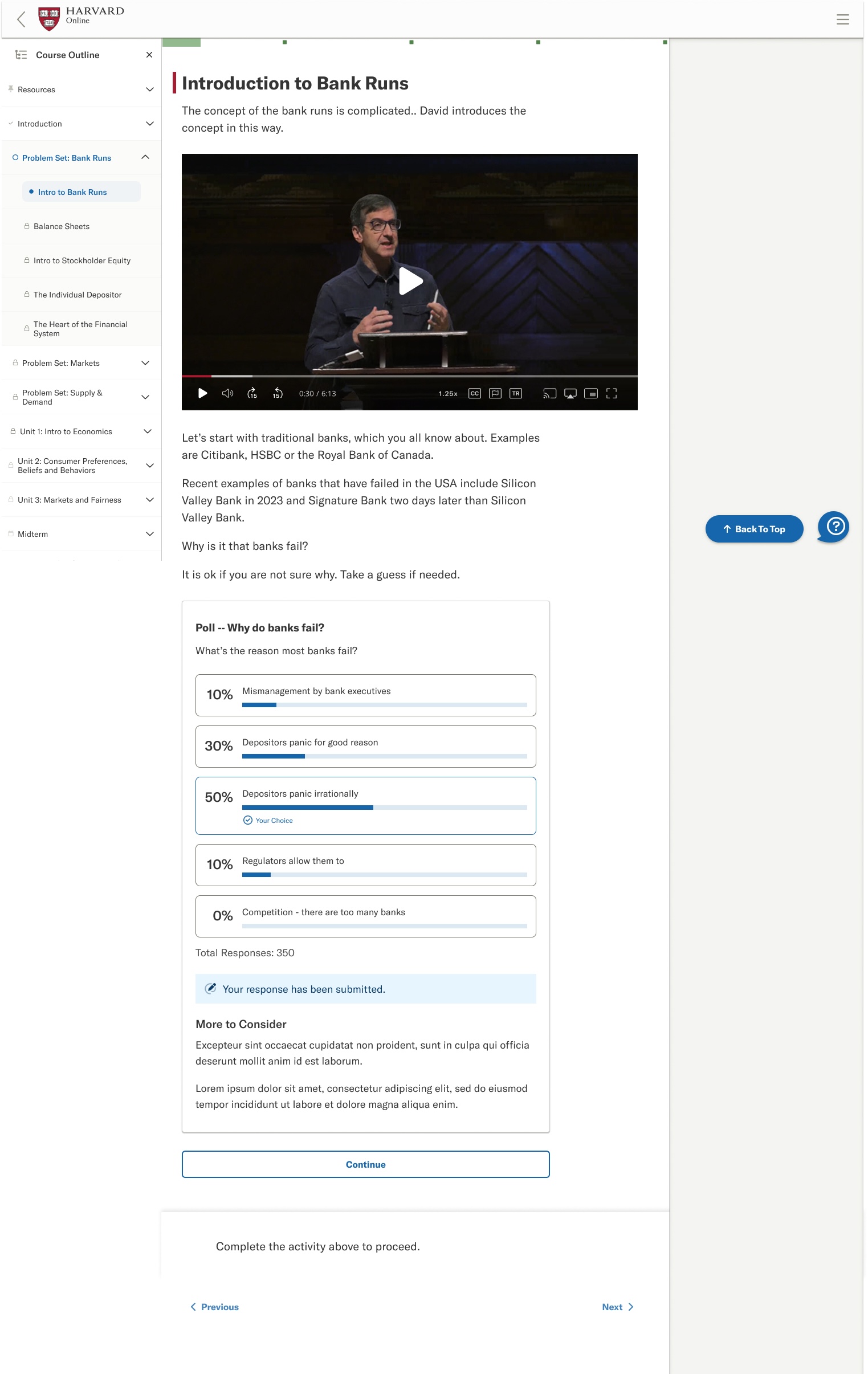
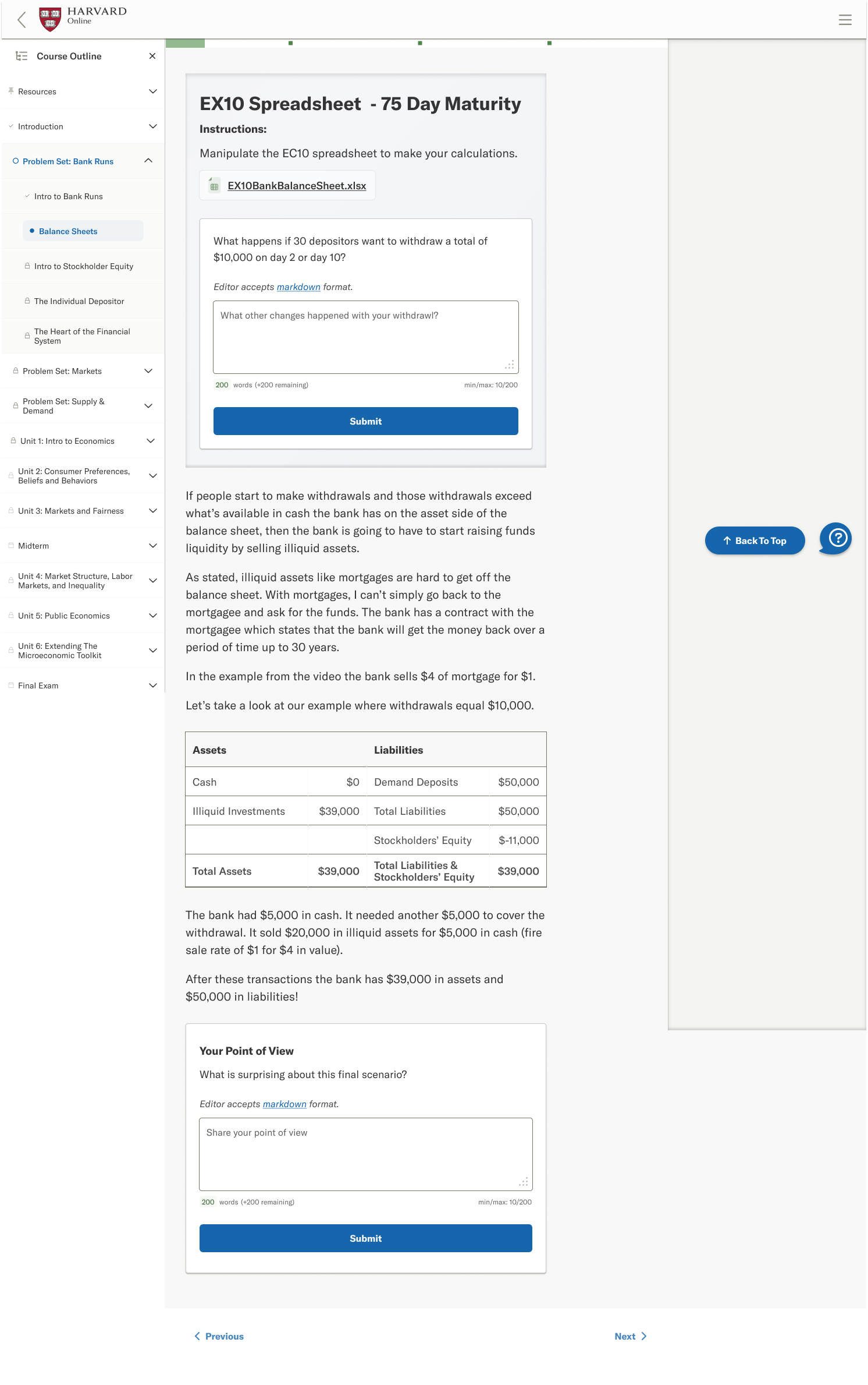
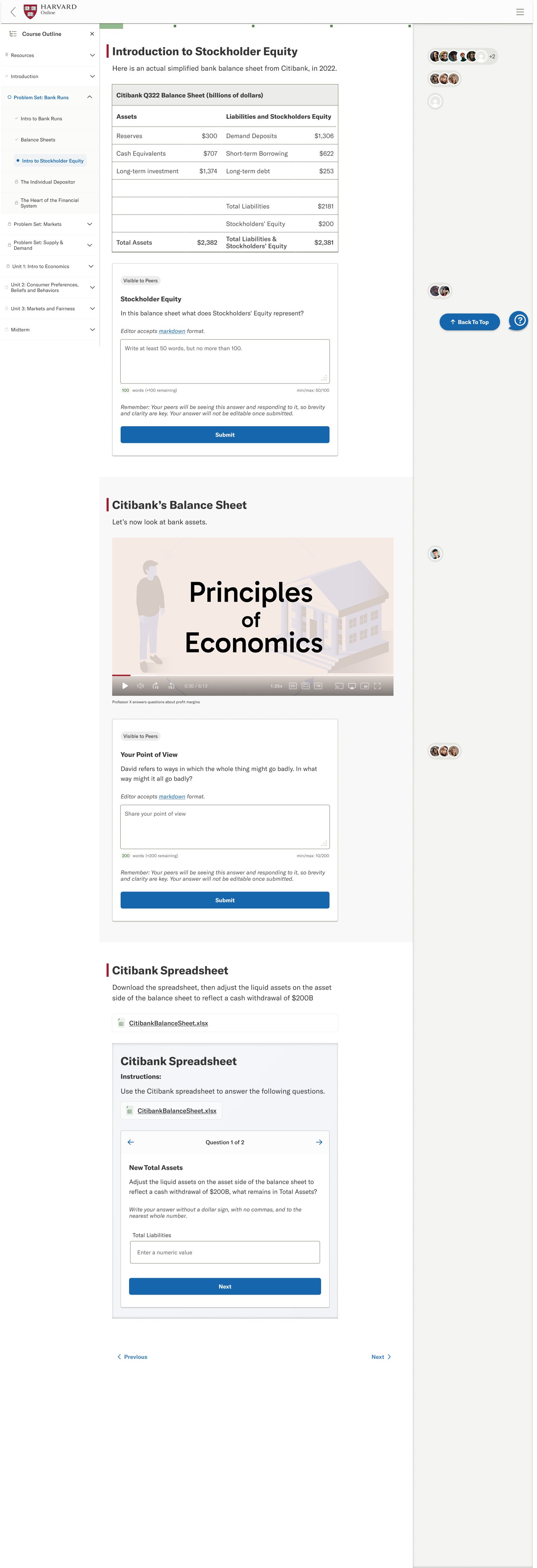
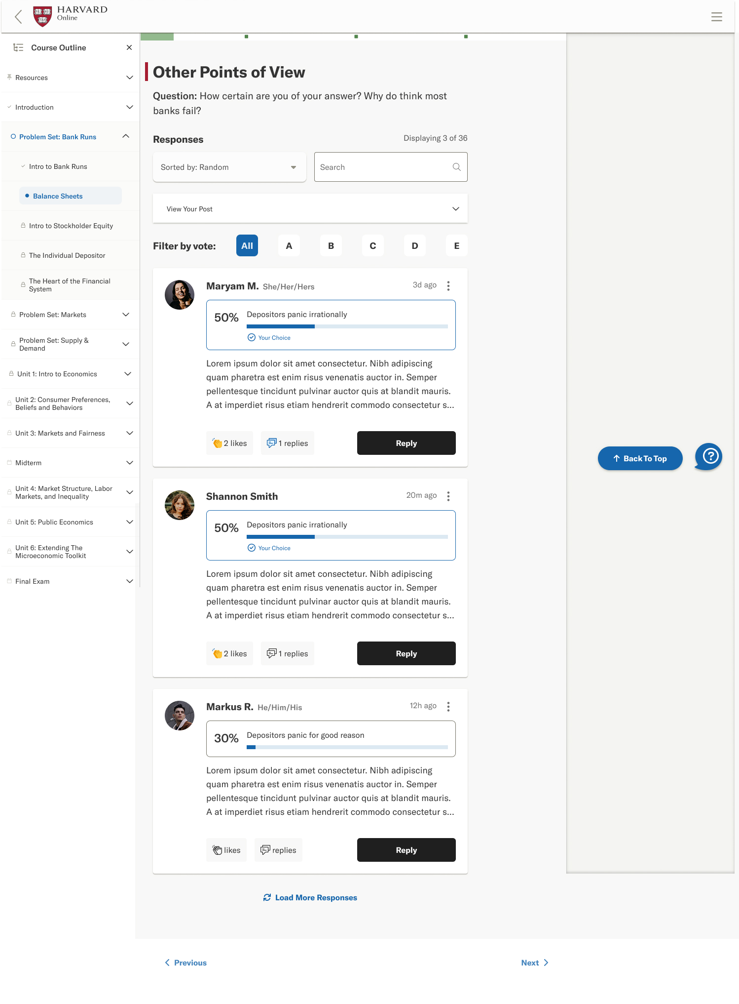
Platform screens: dashboard, video content, interactive assessments, and course exploration
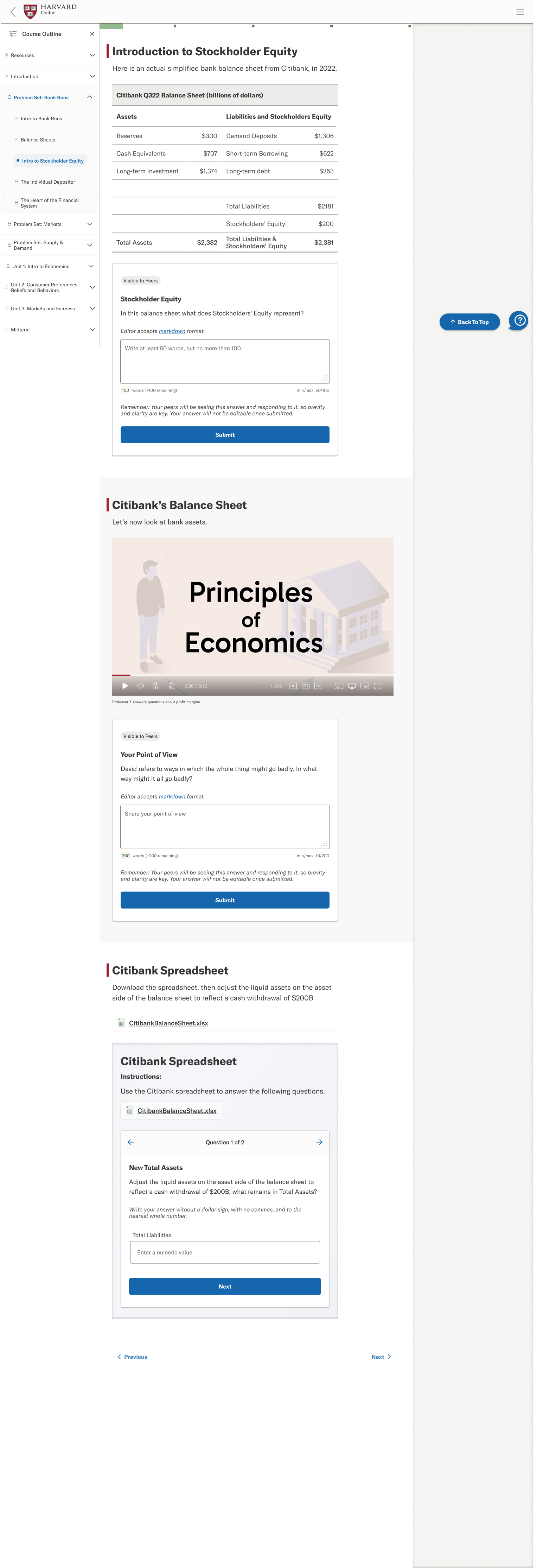
Interactive Exercises
Real-time data analysis exercises that make complex financial concepts tangible through hands-on exploration.
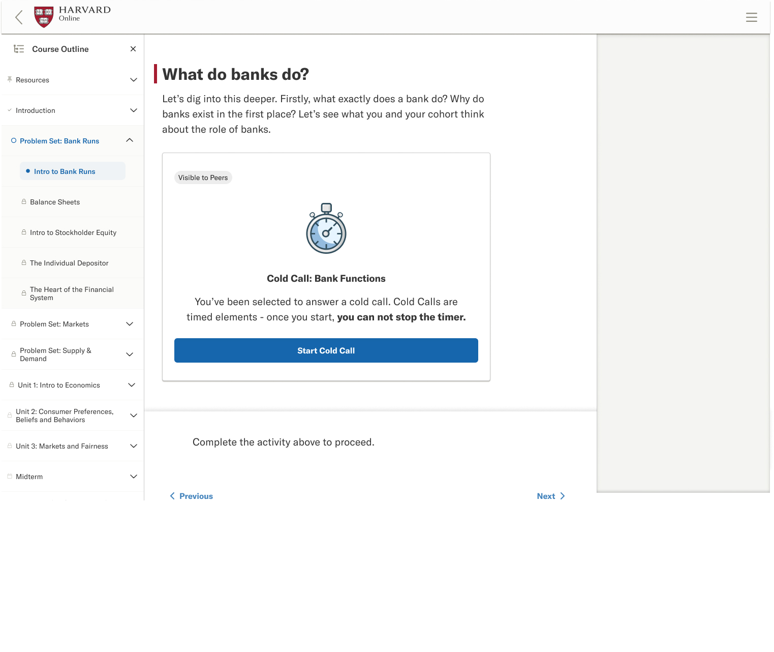
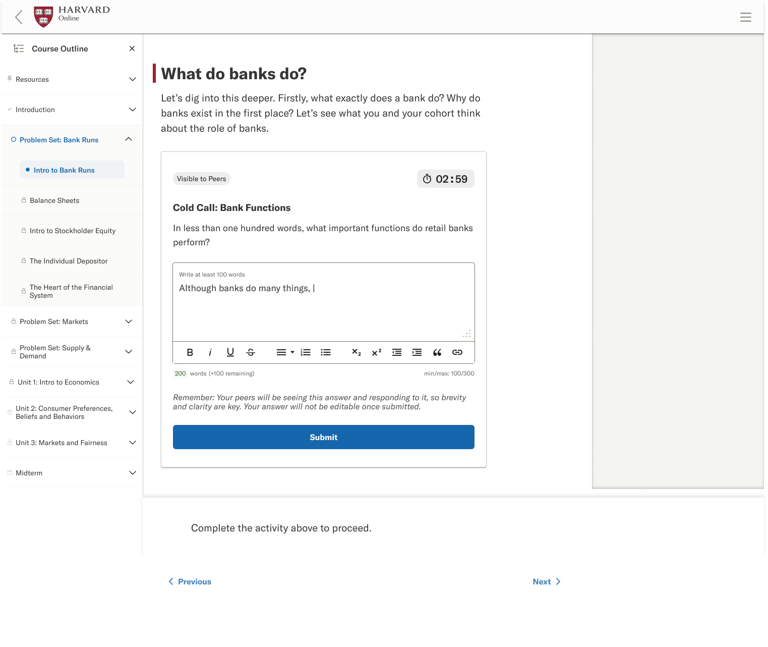
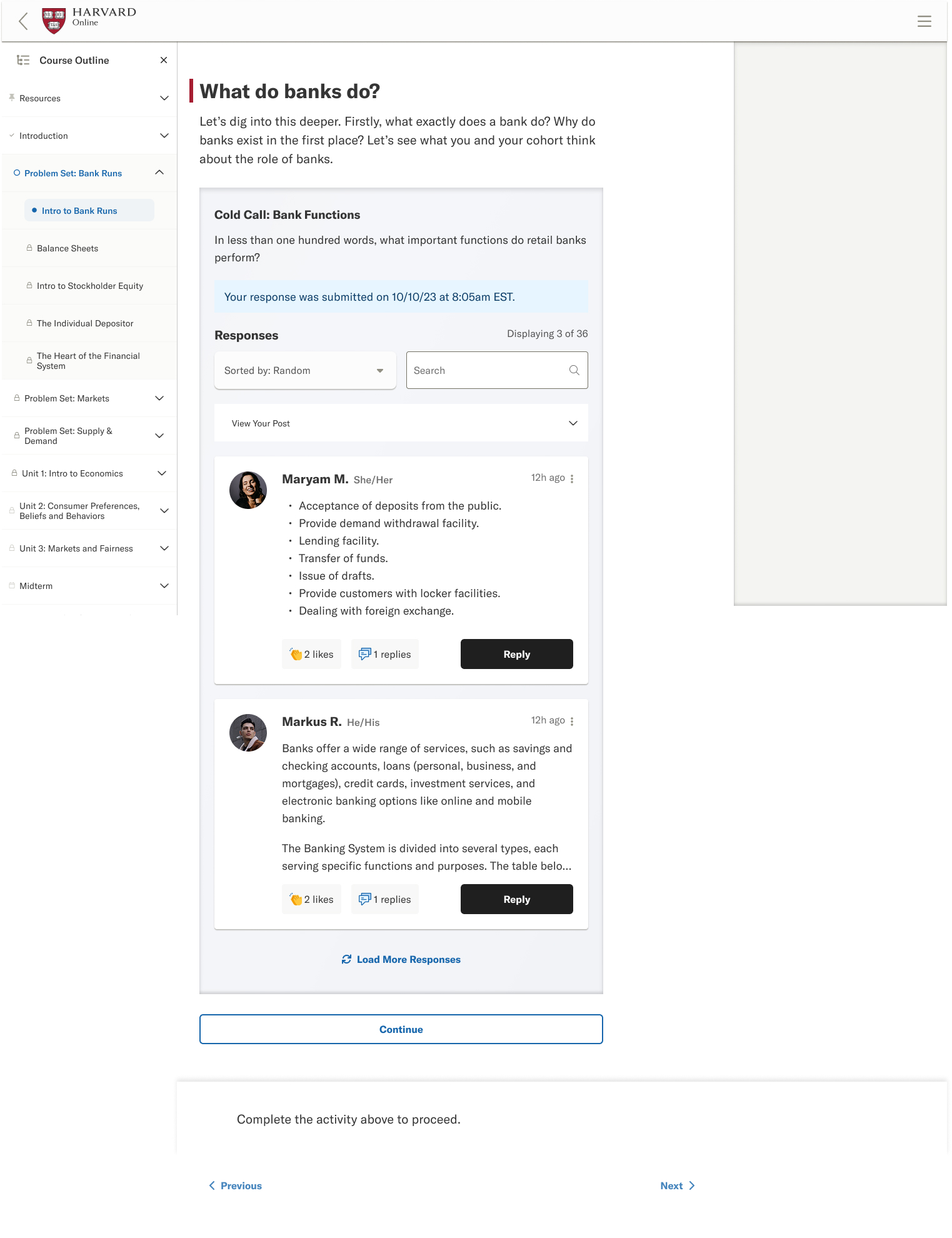
Cold Call Simulations
Simulated classroom experiences that replicate the pressure and engagement of Harvard’s signature teaching method.
Mobile Responsive
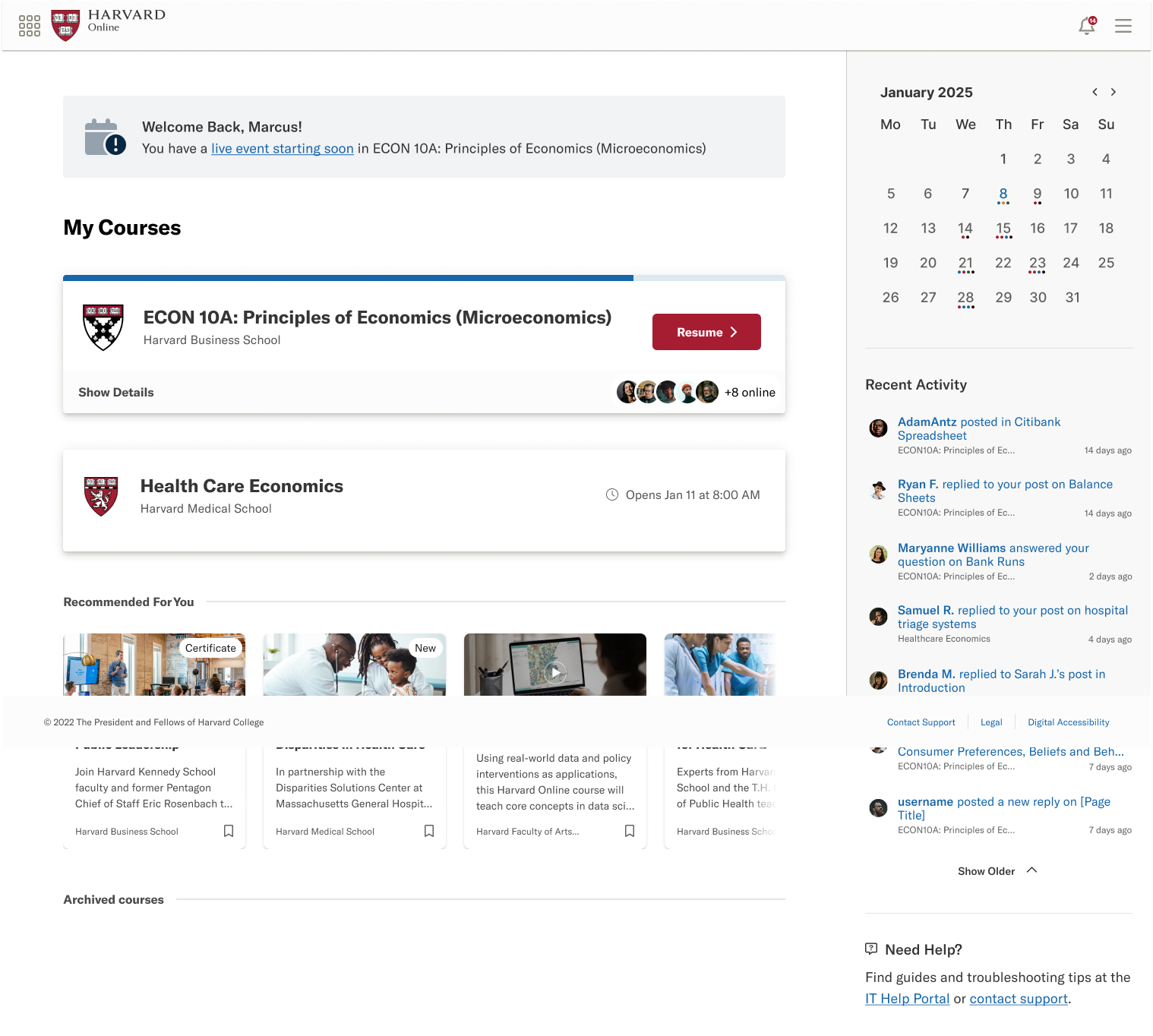
The platform adapts seamlessly to mobile devices, giving learners full access to courses, assessments, and community features on any screen size.
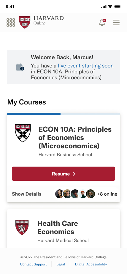

Responsive design - desktop dashboard and mobile experience side by side.
Contribution & Deliverables
The Result
Harvard Law School reported a nearly seamless transition from their previous platform at MVP launch. Harvard Online has since expanded to over 400 courses from 8 schools and institutes (including Harvard Business School Online, Kennedy School, and Harvard Law), supporting more than 10,000 learners across 20+ countries. The design system I built remains the foundation for all platform development, and every feature released to learners has been designed by me, working part-time.