Product Design
Carnegie Learning Visual Design
Reimagining mathematics training and testing portals across four age groups to make learning feel like less of a chore.

The Client
Carnegie Learning is a leading publisher of research-based mathematics curricula, with software used by over 500,000 students across the United States. Their adaptive tutoring platform, MATHia, is built on decades of cognitive science research but the interface hadn’t kept pace with the learning science behind it.
The Problem
Students were disengaged. The tutoring software was powerful under the hood, but it looked and felt like a standardized test: sterile, intimidating, and forgettable. Younger students had no reason to come back to it. Older students found it tedious. And teachers had limited visibility into where individual students were struggling, making it hard to intervene at the right moment. Carnegie needed to make the experience engaging across four very different age groups without refactoring their legacy codebase.
The Approach
The constraint was unusual: I was designing a “skin” that had to transform the emotional experience of the software without changing the underlying system. Each age group needed its own personality. For K-6, that meant surprise and delight with animations, playful characters, and rewards that made math feel like a game. For middle schoolers, it meant agency via custom profiles, illustrated guide characters they chose themselves. For the adult product (Savant), the tone shifted to sophisticated and competitive, with a fox mascot that played on the desire to outsmart peers. Across all four, I redesigned the teacher-facing reporting to use color cues that made student struggles immediately visible at a glance.
The Solution
What started as a single K-6 prototype grew into a full engagement across four product lines. The initial space-themed design was so well received in user testing with students and teachers that Carnegie expanded the contract to include middle school, high school, and adult learning portals, plus a complete overhaul of the teacher reporting experience. Each product got its own visual identity and interaction style, all built to work within the existing technical architecture.
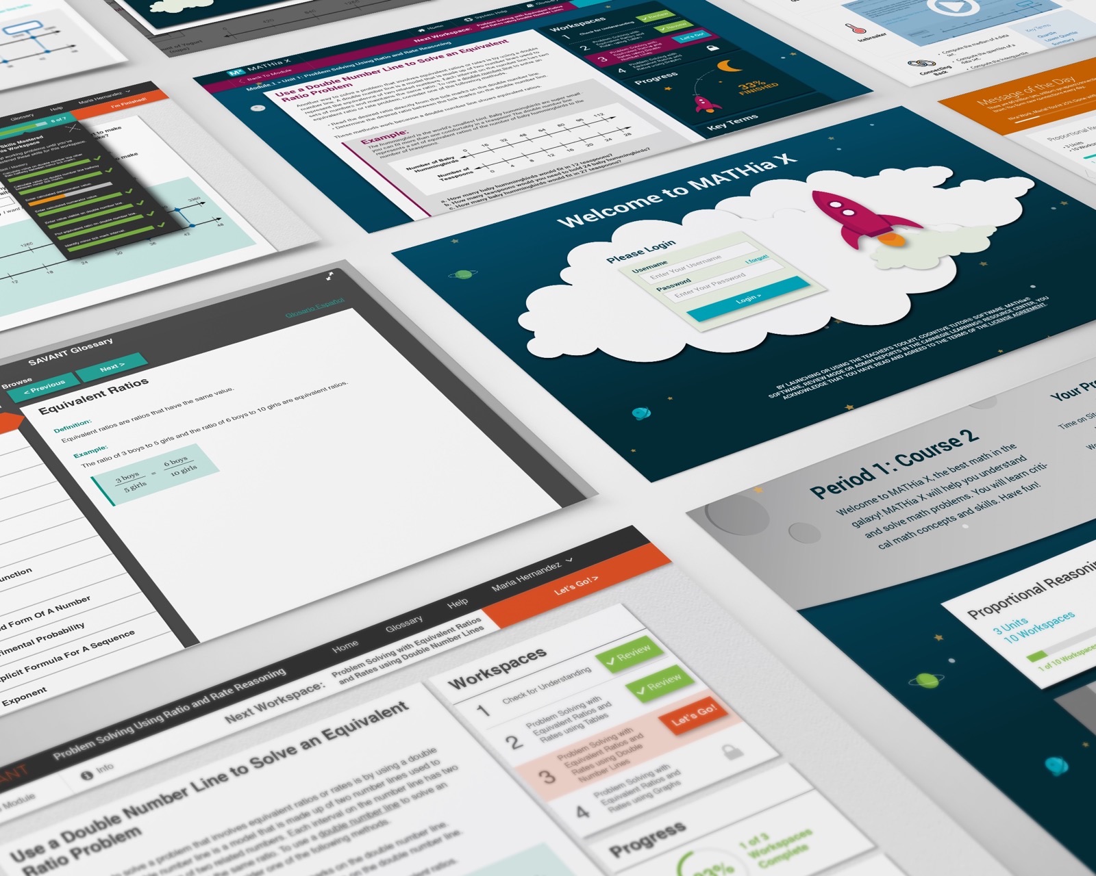
Product screens spanning K-6 through adult learning portals, each with its own visual identity.
Contribution & Deliverables
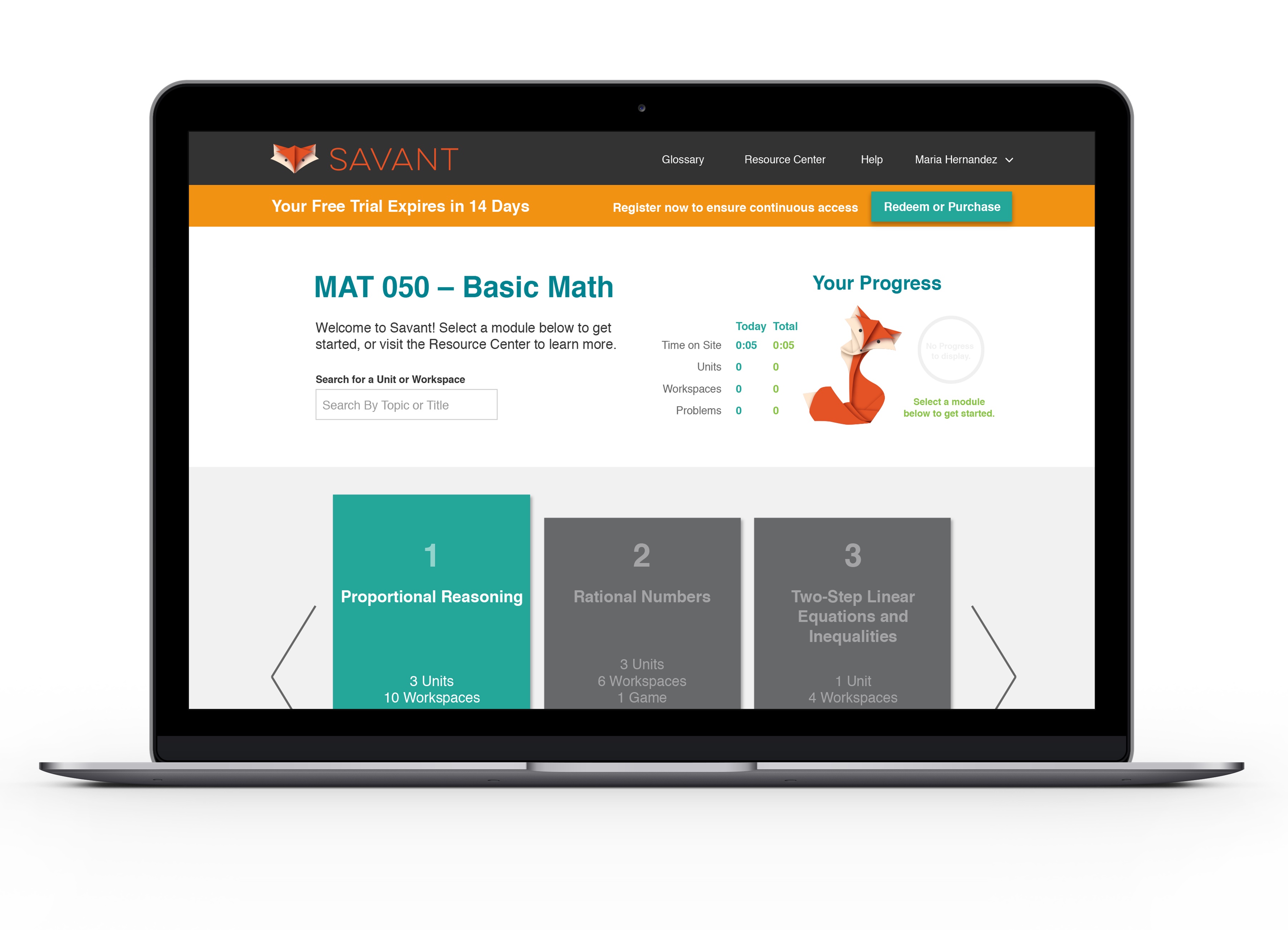
Character illustrations and branding - from playful space themes for K-6 to the sophisticated Savant fox for adults. Additional age-group screens coming soon.
The Result
Carnegie Learning’s in-house teams developed the designs and they were well received by both students and teachers in testing. The initial K-6 prototype was strong enough to expand the engagement into three additional product lines, a clear vote of confidence from the client! While the company has since rebranded and iterated on the visuals, the core design patterns and interaction models I created are still seen daily by students in over 1,300 U.S. school districts.